

The Property Investor's Playbook
Make smarter property investment decisions with data-driven insights. Identify properties with stronger capital growth potential while managing downside risk—based on facts, not gut instinct.
Singapore Private Property Transactions — All 28 Districts
105,750 transactions · 2,289 projects · Jul 2021 – Jul 2026 (61 months). All "PSF" trend figures use resale-only transactions to strip out the new-launch price premium.
1. Region resale $PSF trend, 2021–2026
Core Central Region (CCR, prime) grew the slowest; Outside Central Region (OCR, suburbs) and Rest of Central Region (RCR, city-fringe) grew more than twice as fast over the same 5 years.
View as table
2. 5-year resale $PSF change by district, ranked
Every district with a reliable resale sample (≥15 tx/yr in its first and last year), sorted from strongest to weakest. Blue = growth, red = decline. District 1 — the original sample district — is the only outright decliner.
View as table
3. Floor level vs $PSF
National resale median, bands with 20+ transactions. Higher floors consistently command a premium.
View as table
4. Unit size vs $PSF, by region tier
National resale median by size band, split CCR/RCR/OCR (resale-only, bands with 15+ transactions per region). The pooled U-shape (small AND large units pricier per sqft) turns out to be mostly a CCR pattern — CCR stays flat around $2,050-2,160/sqft across every size band, while RCR and especially OCR show a steady, near-monotonic decline in $psf as units get bigger. Splitting by region changes the read: in the suburbs, bigger really is cheaper per sqft; in the core, size barely matters to the psf level.
View as table
5. Tenure type vs $PSF
Resale-only comparison. Freehold carries a ~14% premium over 99-year leasehold nationally.
View as table
6. Sale-type mix by region
New Sale / Resale / Sub Sale share of transactions, by region tier.
View as table
7. Highest sub-sale ("flipping") rate by district — top 10
Sub-sale = resale of a still-uncompleted unit before TOP, a common marker of short-term speculative activity. A high rate signals a more speculative buyer mix, not automatically a bad district.
View as table
Profitability breakdown: unit size, unit type, MRT access, school access
"Profitability" here is the same 5-year resale $PSF appreciation used throughout (Jul 2021 → Jul 2026, resale-only, a market-level proxy — not any individual owner's return). MRT and School charts use a district-level connectivity/school-cluster tier (this data has no per-project MRT distance or school distance at national scale — see the Overview tab of the companion workbook), so read them as "how districts with this general access level performed," not a distance-vs-price regression on individual buildings.
8. Profitability by unit size
5-yr resale PSF appreciation by size band. Mid-size 2-4BR family units appreciated fastest — the same units that were cheapest per sqft (chart 4) also grew the most.
View as table
9. Profitability by unit type
5-yr resale PSF appreciation, URA "Apartment" vs "Condominium" tag. Condominium (mostly larger, mass-market developments with full facilities) edged out Apartment despite a lower absolute $psf level.
View as table
10. Profitability by MRT connectivity tier (district-level)
Districts grouped into a connectivity tier, appreciation weighted by transaction volume. "Excellent"-MRT districts are almost all CCR/prime (D1, D2, D6, D7, D9, D20) — their weak +12.4% is the CCR-underperformance pattern from chart 2 showing up again, not evidence that good MRT access itself hurts returns. District 24 (Poor/Limited tier) has no resale history yet and is excluded.
View as table
11. Profitability by school-cluster tier (district-level)
Same caveat as MRT: the "Low" school tier is dominated by CBD/Sentosa districts (D1, D2, D4, D6, D7) plus new-town D24 — the pattern tracks region tier more than it tracks school access on its own.
View as table
Measured MRT & school distance vs profitability (all 2,304 projects, geocoded)
Charts 10-11 above used a district-level tier. These charts use the real thing: every project individually geocoded, with straight-line distance to its nearest MRT/LRT station and nearest primary school (full list in the companion "SG_Condo_MRT_School_Analysis.xlsx" workbook). Looked at across all projects together, distance barely correlates with appreciation — because region tier (CCR/RCR/OCR) is doing most of the work and OCR projects sit farther from MRT/schools on average yet appreciated the most. Splitting by region tier removes that confound and tells a clearer story.
12. MRT distance vs profitability, by region tier
Within OCR, appreciation falls fairly steadily as MRT distance increases (28.8% → 21.2%). CCR and RCR show no clean pattern — CCR's >1.2km band (n=12) and RCR's >1.2km band (n=3) are too thin to trust.
View as table
13. School distance vs profitability, by region tier
Same cut for school distance. OCR again shows the cleanest gradient (28.3% → 18.3%); CCR shows a smaller but real drop-off past 1.2km; RCR is essentially flat regardless of school distance.
View as table
14. OCR deep dive: appreciation by proximity quintile
The 479 OCR projects split into 5 equal-sized groups by distance. This is the single cleanest signal in the whole distance analysis: in OCR specifically, buying closer to an MRT station (and, a bit less strongly, closer to a primary school) is associated with meaningfully higher 5-yr appreciation.
View as table
Does living near a top-ranked school pay off?
182 primary schools ranked (schoolmatters.sg-derived) and geocoded, split into 3 tiers: the top 18 ("Outstanding"), the next 27 ranked 19–45 ("Very Good"), and the remaining 137 ranked 46–182 ("Good"/"Average"). Each of the 2,304 condos is bucketed by the single best school tier within 1km (a project within 1km of both a top-18 and a rest-tier school counts as top-18).
15. 5-yr appreciation by nearest school-ranking tier (within 1km)
Counterintuitive: being within 1km of a top-18 school does not show the best appreciation — the 19-45 and Rest tiers both out-performed it. This is the same region-tier confound as charts 12-13: top-18 schools cluster disproportionately in CCR (42.7% of top-18-adjacent condos are CCR, vs just 6.8% for the 19-45 tier), and CCR was the weakest-appreciating region nationally. See the region-controlled breakdown below before drawing a conclusion.
View as table
15b. Same comparison, controlled for region tier
Once region is held constant, top-18 proximity still doesn't show a clear edge over 19-45 or Rest — in OCR it trails both; in RCR it edges out 19-45 but still trails Rest; in CCR it beats "Rest" and "None" but the 19-45 CCR sample is thin (n=20) and noisy. Read this as: which primary school is nearest matters far less to 5-yr appreciation than which region the project is in.
View as table
Stop guessing which condo will actually make you money.
Singapore has 2,300+ private condo projects and 80 Executive Condominiums. PropScore SG turns 105,750 real transactions into a single, data-backed score for each one — so you know which projects have a genuine track record before you fall in love with a showflat.
Every project on PropScore SG is scored the same way a careful analyst would score it by hand — region momentum, lease decay, floor and unit-type pricing, MRT and school proximity (real geocoded distance, not a district guess), developer and resale track record, and liquidity — then rolled into one 0–100 rating with the full breakdown shown, not hidden behind a black box.
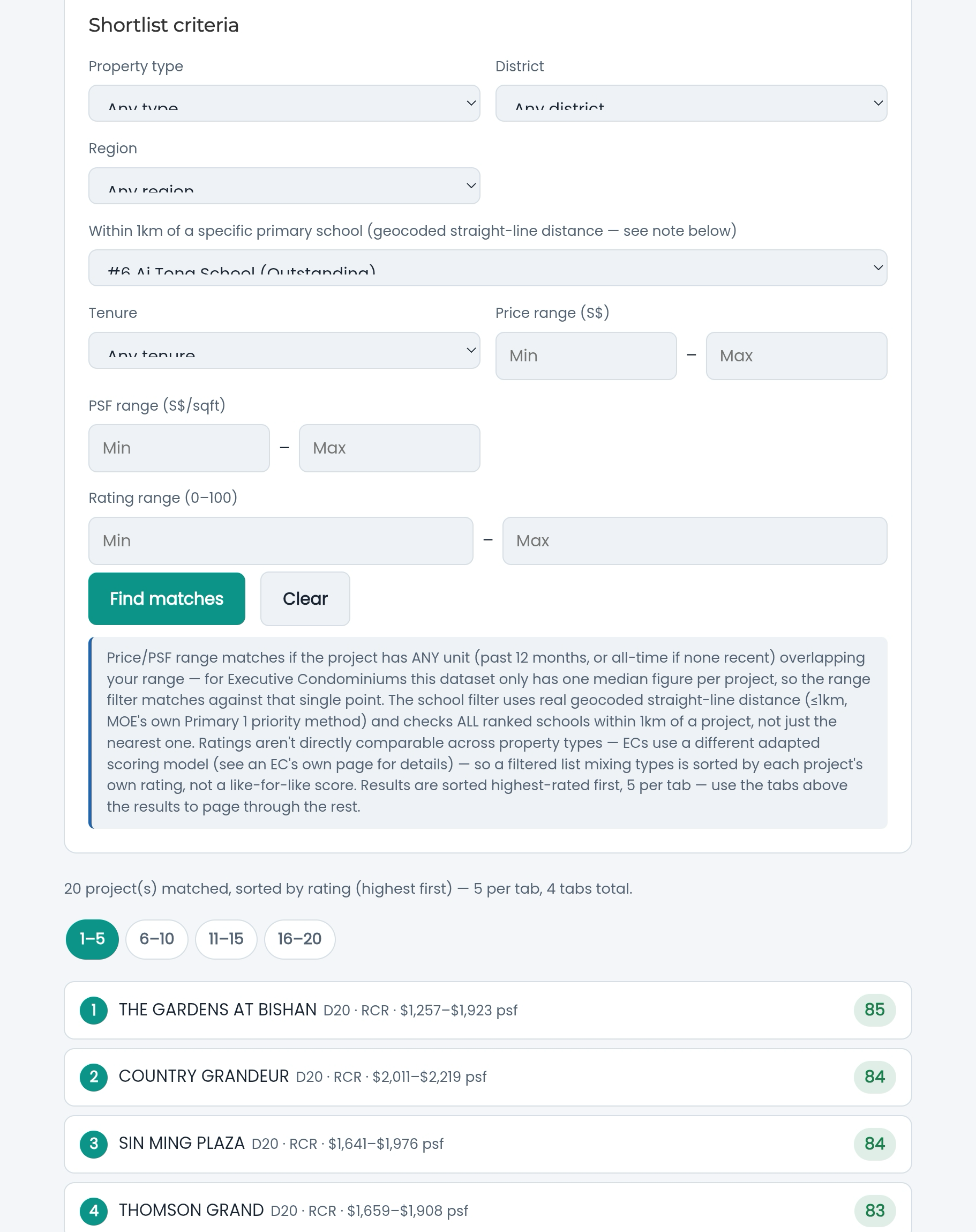
Search any project by name, or tell us what you're looking for — district, budget, tenure, a specific school within 1km — and get a ranked shortlist in seconds.
Free. No sign-up. 2,369 projects covered — Jul 2021 to Jul 2026.
How PropScore SG Works
Most "hot project" talk is vibes. PropScore SG is built entirely from transaction records — what units actually sold for, when, and how that compares to the rest of the market — so the score reflects what happened, not what a listing agent says might happen.
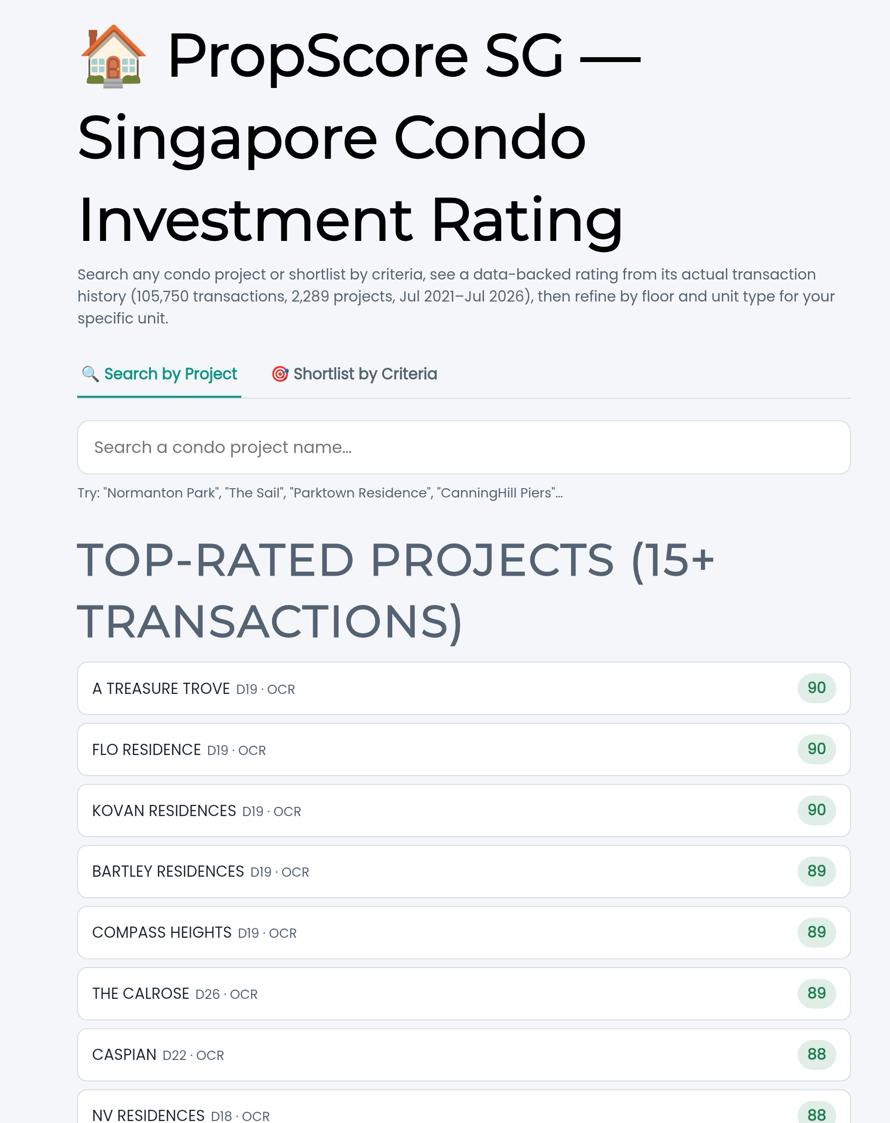
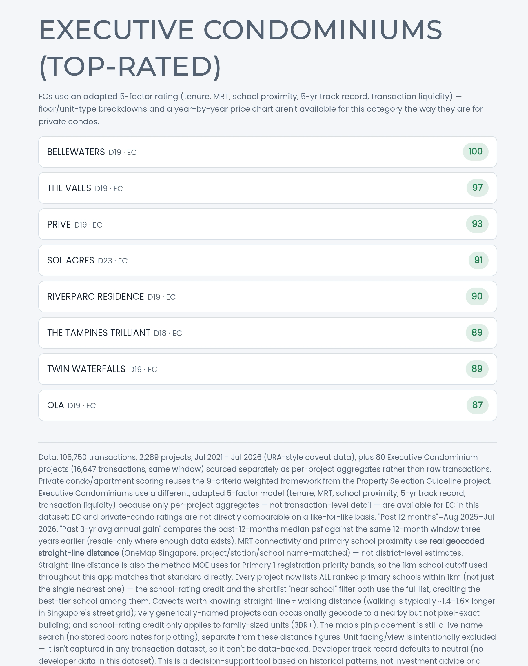
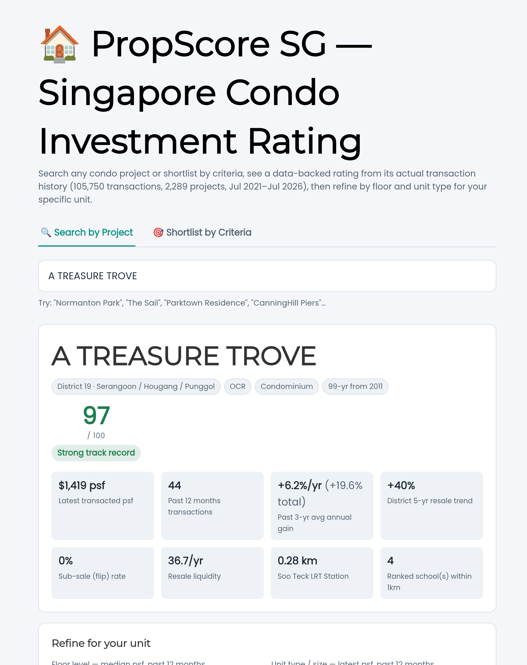
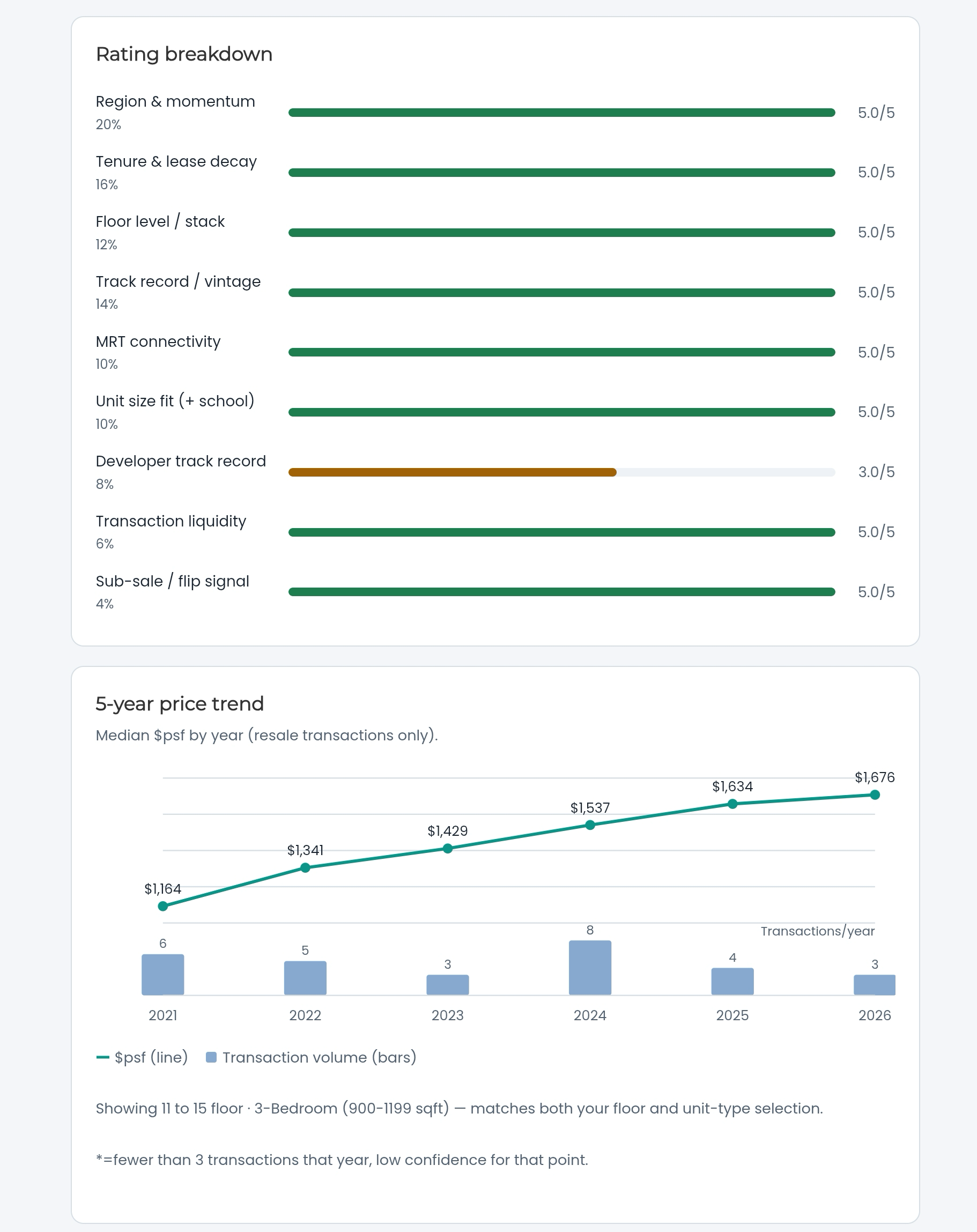
The data
Every private condo and apartment score is built from 105,750 real transactions across 2,289 projects, Jul 2021–Jul 2026 (URA-style caveat data). Executive Condominiums are covered separately — 80 EC projects, 16,647 transactions — using project-level aggregates rather than raw transaction records, so ECs are scored on their own adapted model (see below).
The private condo/apartment score — 9 weighted criteria
Each project is scored 1–5 on nine factors, weighted, and converted to a 0–100 rating:
- Region & momentum (20%) — how the district's own resale psf has trended over 5 years, not just its prestige. (The data shows OCR and RCR districts actually outperformed CCR over this window.)
- Tenure & lease decay (16%) — freehold, 999-year, or years remaining on a 99-year lease, since lease decay is a measurable resale discount, not just a theoretical risk.
- Floor level / stack (12%) — how this project's own floor bands have priced relative to each other.
- Track record / vintage (14%) — years of verifiable resale history and whether the project has beaten its own district's trend.
- MRT connectivity (10%) — real geocoded straight-line distance to the nearest MRT/LRT station, not a district-level estimate.
- Unit size fit + school proximity (10%) — pricing efficiency by unit size, with a credit for family-sized units near a ranked primary school within 1km.
- Developer track record (8%)
- Transaction liquidity (6%) — resale transactions per year, a proxy for how easily you could exit.
- Sub-sale / flip signal (4%) — elevated sub-sale rates as a caution flag worth understanding before buying.
The Executive Condominium score — an adapted 5-factor model
EC data comes as project-level aggregates rather than transaction-level detail, so ECs are rated on tenure, MRT connectivity, primary school proximity, 5-year resale track record, and transaction liquidity — weighted and scored the same 0–100 way, but not directly comparable score-for-score against private condos.
What makes the distances real
MRT and school distances aren't estimated from district boundaries — they're geocoded straight-line distances (OneMap Singapore), the same method MOE itself uses for Primary 1 registration priority. Every project shows every ranked primary school within 1km, not just the nearest one, with the best-performing school credited toward the score.
The honest caveats
PropScore SG shows its assumptions rather than hiding them: unit facing/view isn't in any transaction dataset, so it's excluded rather than guessed at; developer track record defaults to neutral where data isn't available; and every rating is a decision-support tool built on historical patterns — not investment advice or a guarantee of future performance.
Free. No sign-up. 2,369 projects covered — Jul 2021 to Jul 2026.